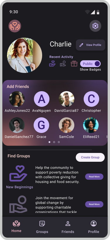
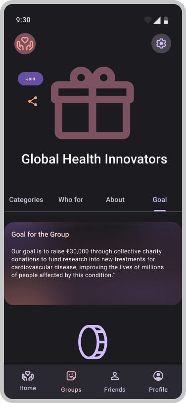
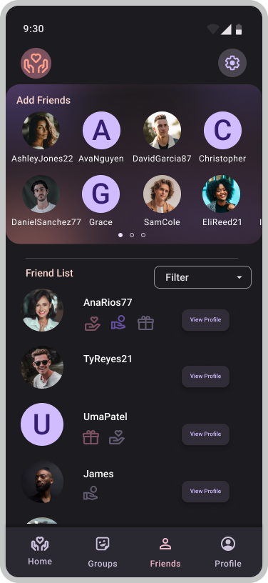
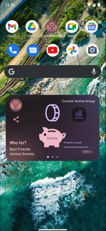
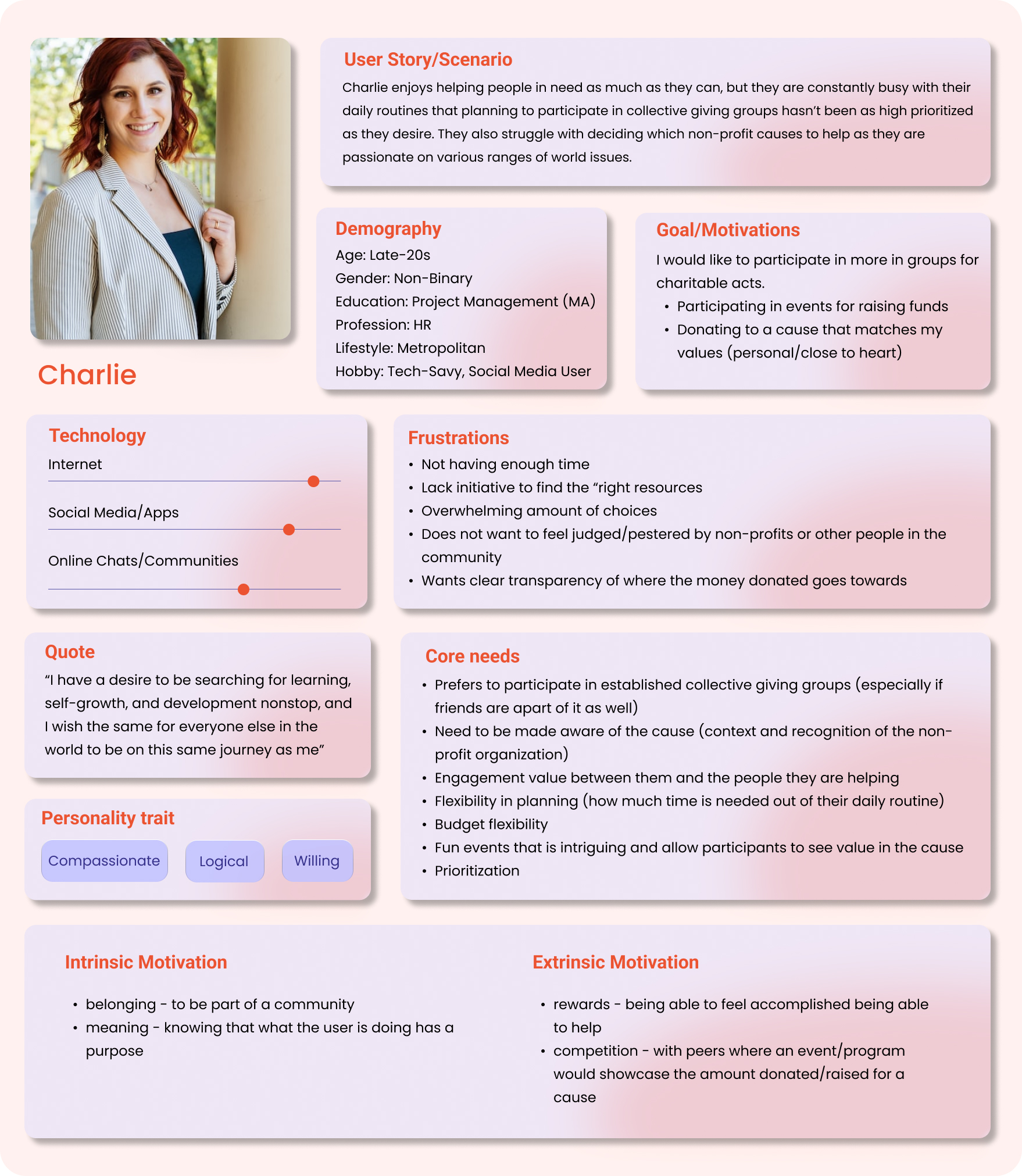
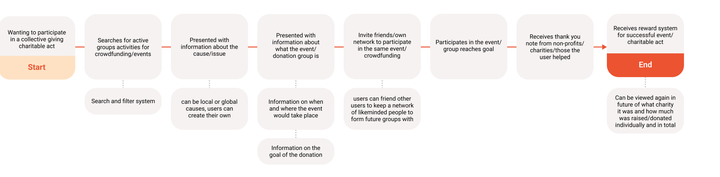
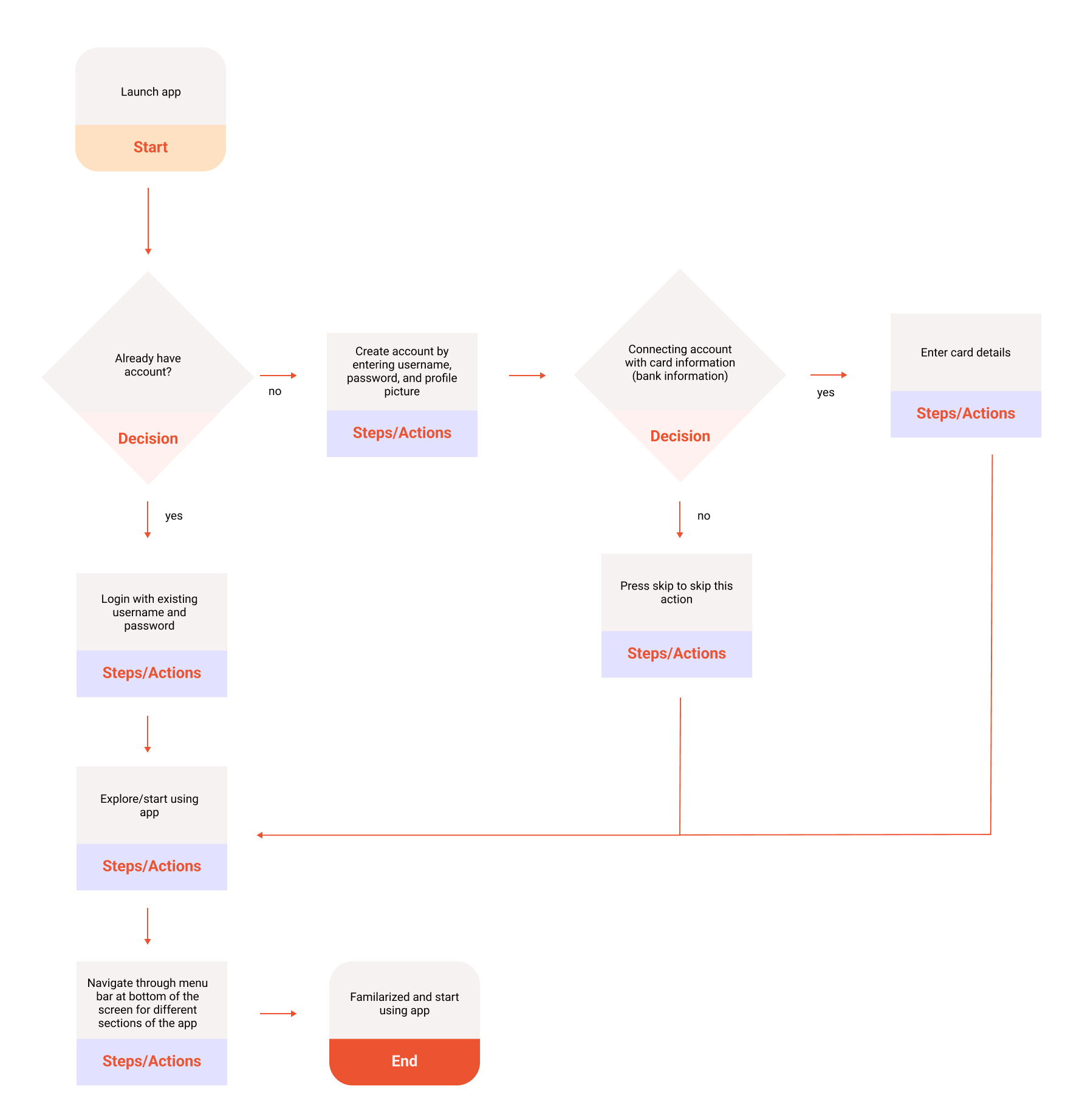
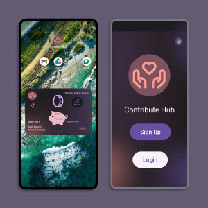
Contribution Hub

The app created to encourage collective giving.

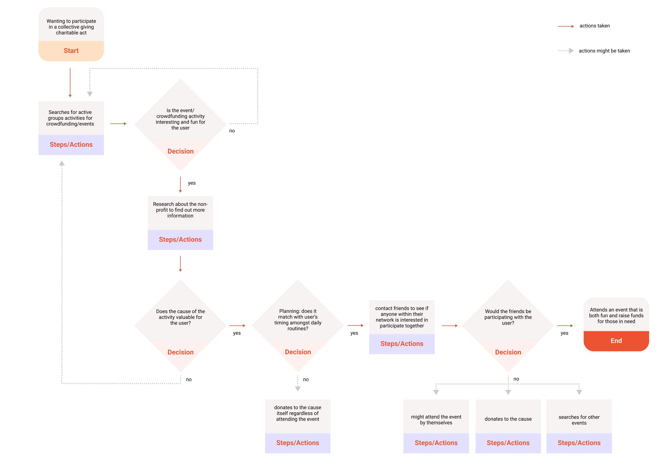
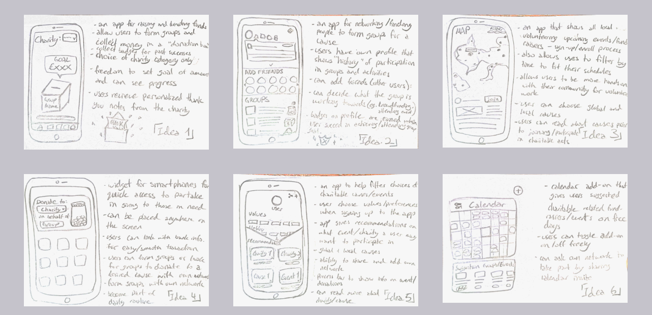
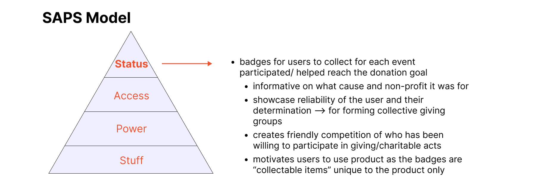
Collective Giving App Design

Project Brief:
How might we supercharge the act of giving together by creating digital products that make collective giving easier and more accessible?
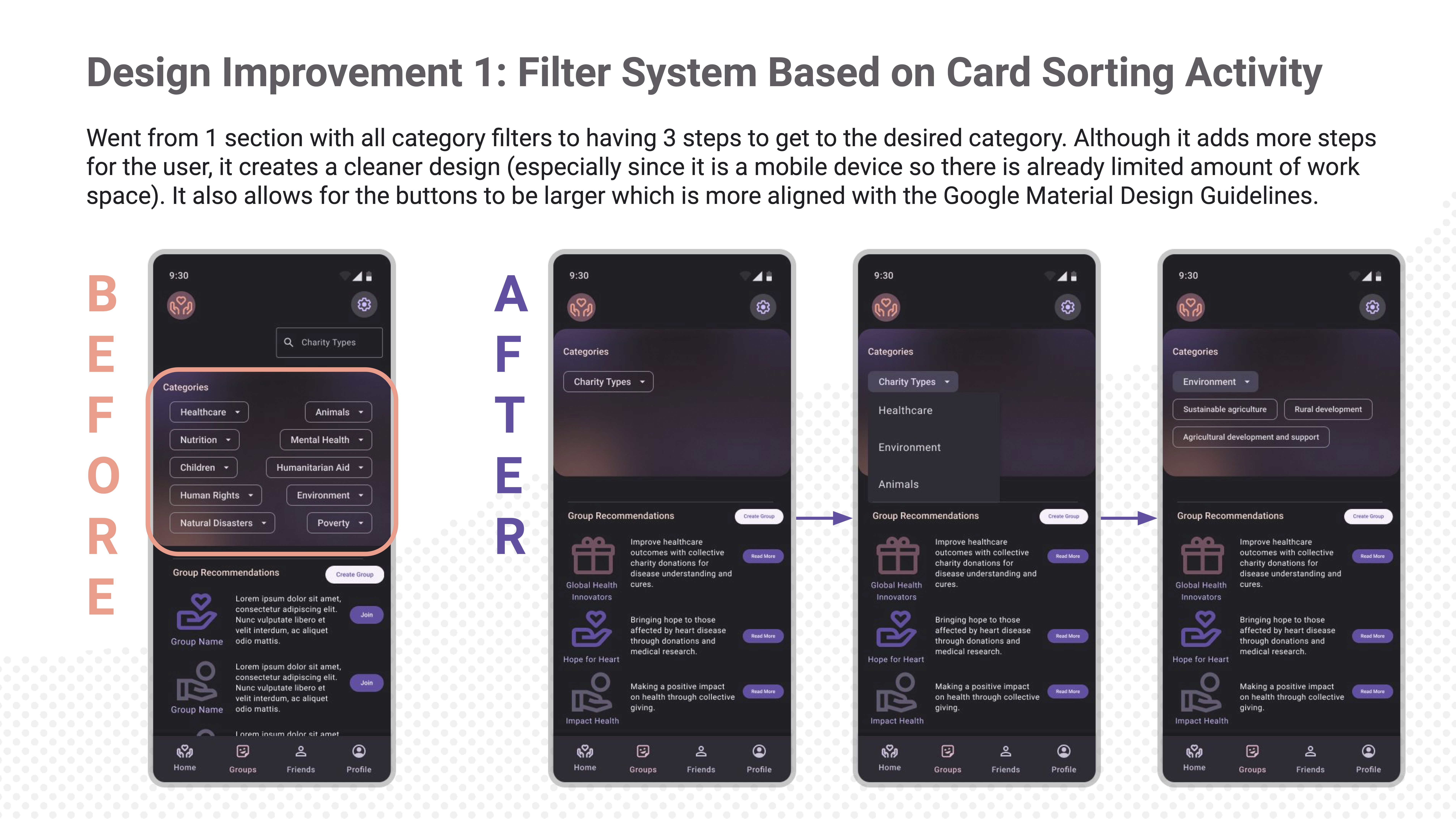
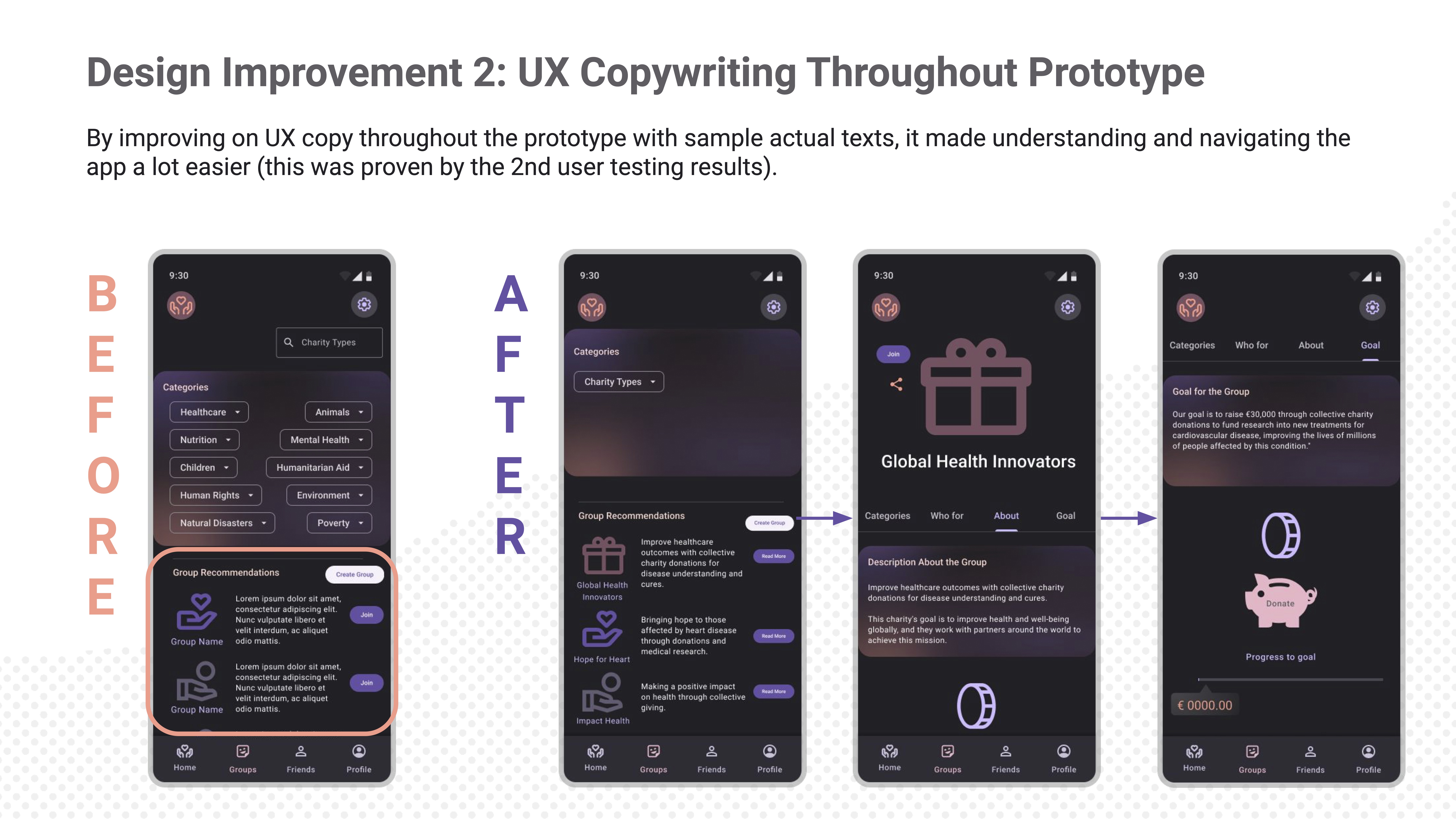
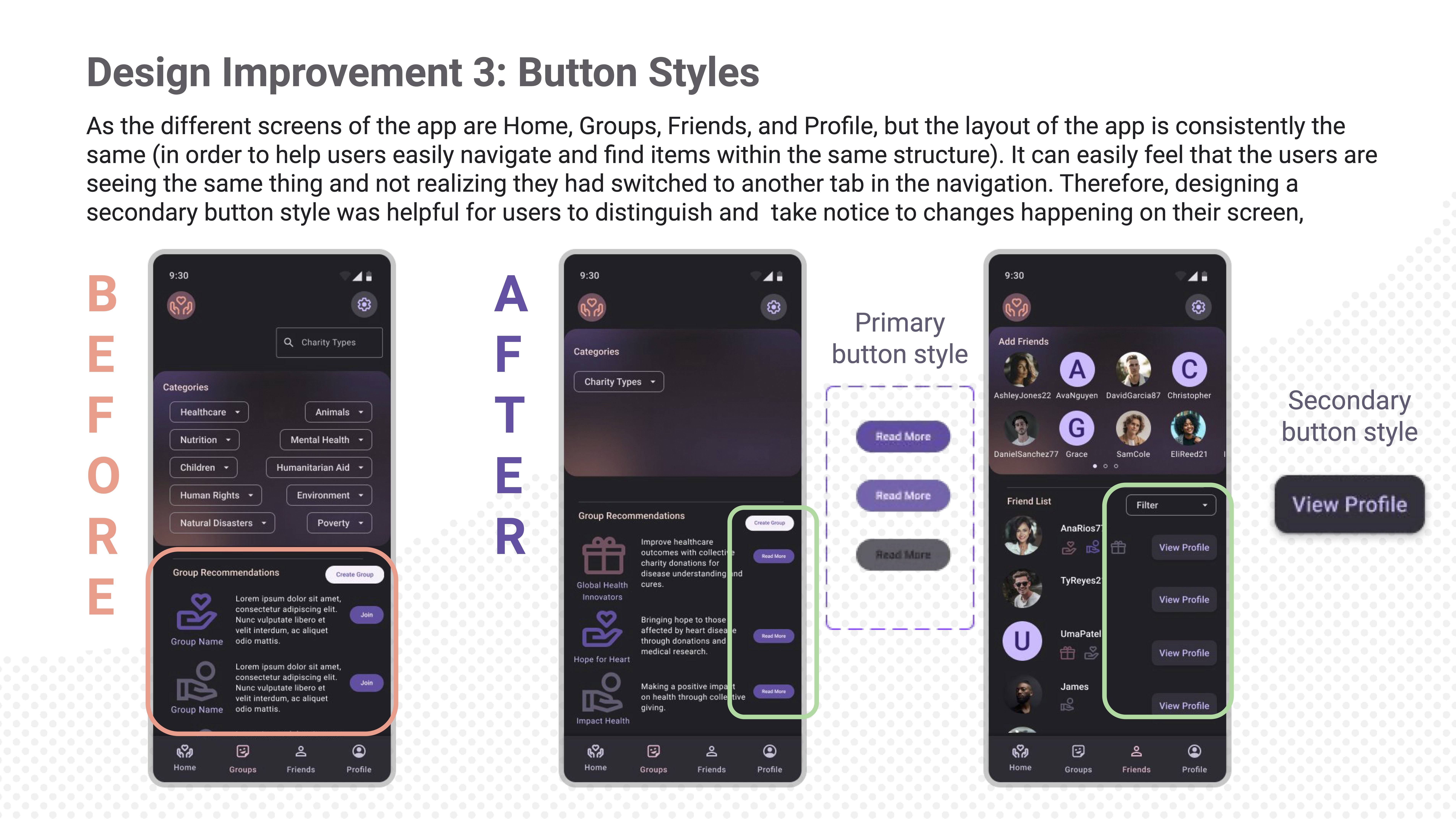
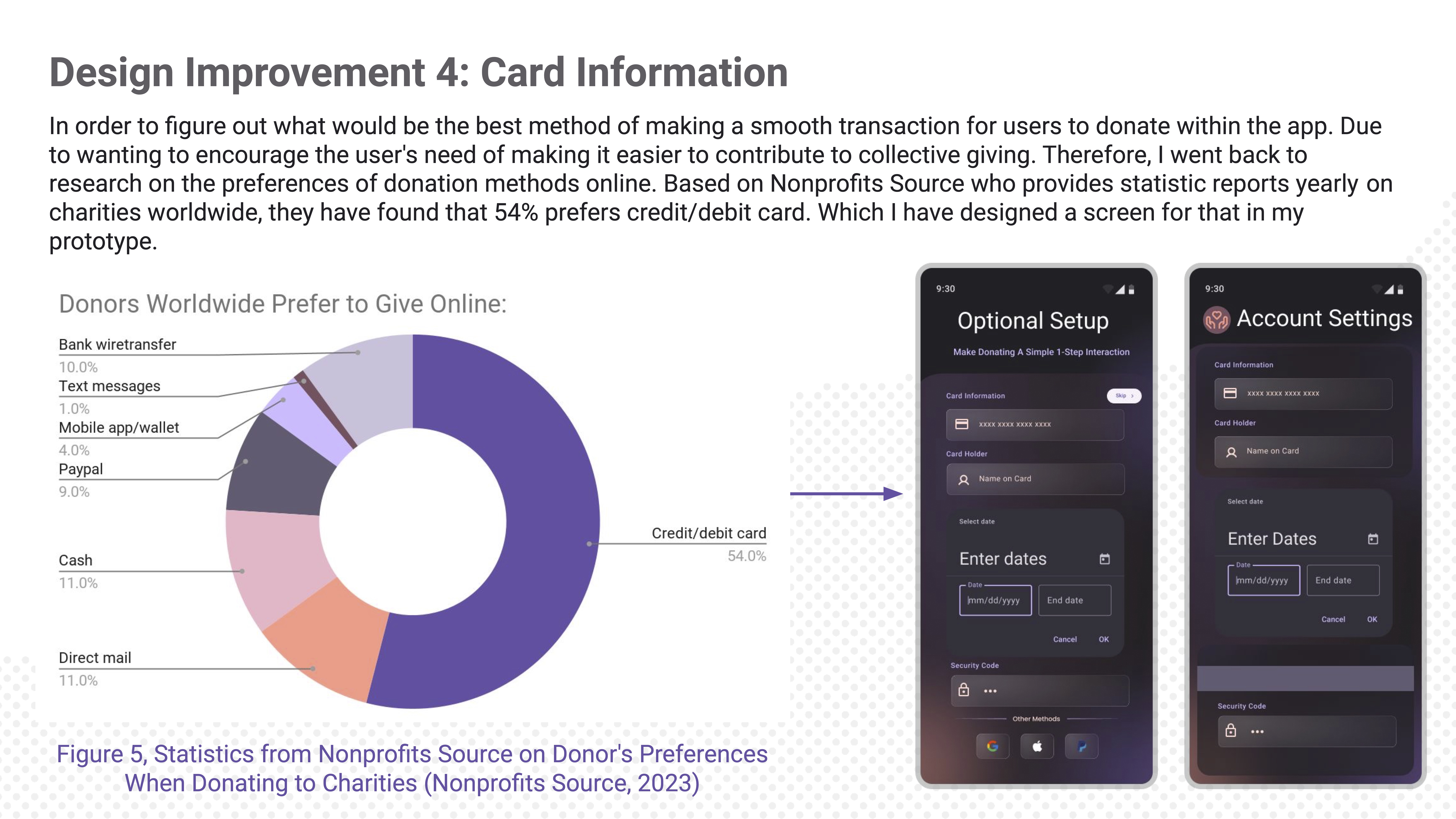
Solution:
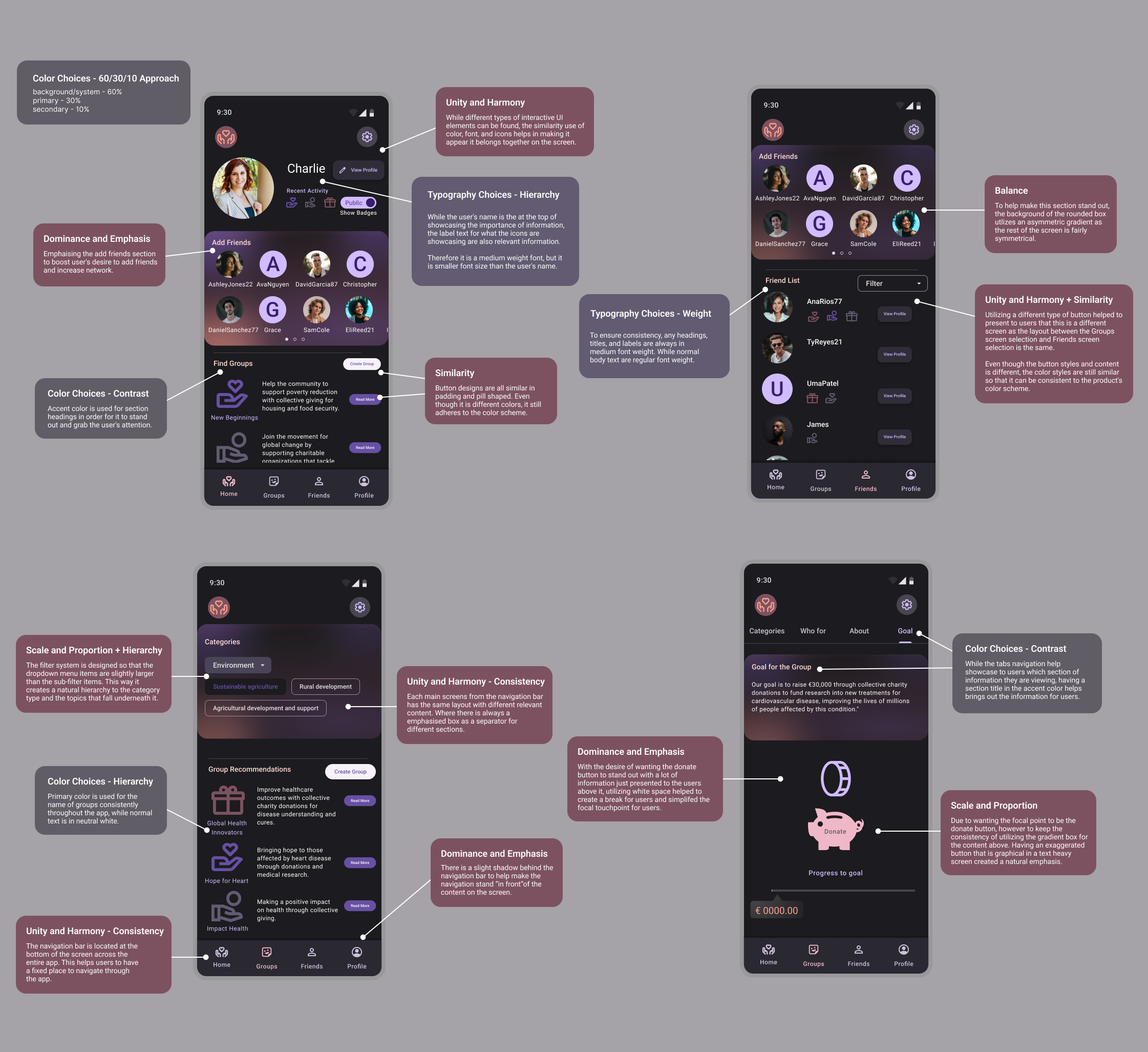
Created an app that encourages users to participate in collective giving.

Timeframe:
12 weeks

Focus area:
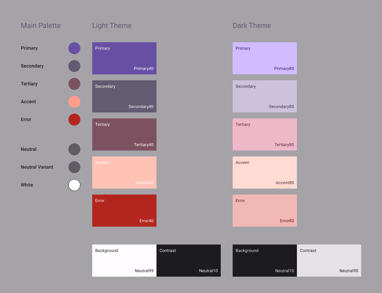
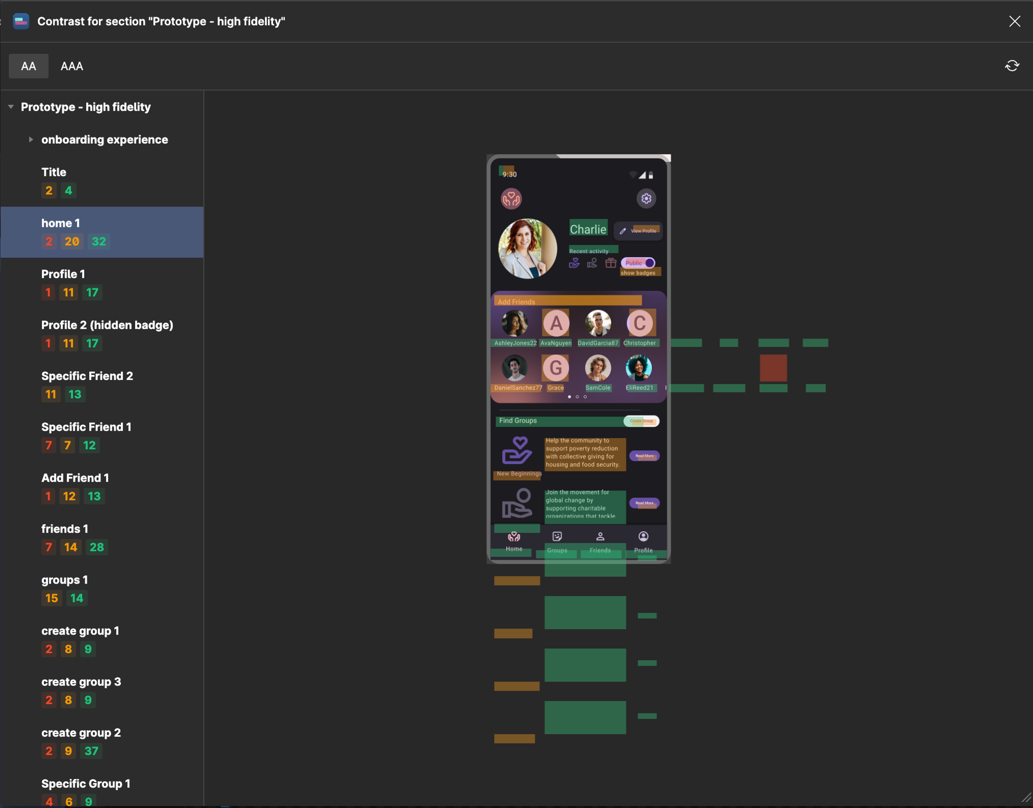
UX research & design, UI design


Home screen
Club section screen
Friend screen


Mockups

Widget Design
With widgets, it can eliminate the need of constant pushy behavior from the app to ask users to donate. It can also help users make it part of their daily routine (this was a comment made during user discussion session) as it is already on their home screen where they would look at every day. It is a more subtle reminder for users who have a bit of extra money to donate, and it is optional to use. Therefore it evokes the flexibility and customization for individual users.

Mockups

Mockups
Donoation UI

Mockups

Mockups
Donation pop-up UI

Mockups

Mockups
Create Group UI form

Mockups

Onboarding Mockup
Sign-up UI

Mockups

Onboarding Mockup
Sign-up UI con.

Mockups

Mockups
Account Settings


I have come to realize that some charities can have a somewhat annoying approach to advertise and push for getting donations. It generally results in very frequent (almost 1 every other day from various of charities) text messages or calls. I feel that there should be a better way of approaching getting donations in a fun way, and less pushy. A semi-structured interview/discussion was conducted in addition to secondary research. While the sample size of participants were small, it was helpful to gather useful initial user thoughts and identifying needs and pain points.

Affinity Mapping

Affinity Mapping
Gathering data insights that is put into clusters identified by related themes/concepts. With this method of organizing findings, it actively tries to refine problems and even tasks to keep in mind of the users and gain a better understanding from the user’s perspective.

Competitor Analysis

Competitor Analysis
I've picked three competitors that are similar to potential ideas of what I would like to design. These organizations focuses on pushing for a community to get together to do a charitable act. The deltas identified are generally areas that I would like to improve and do better in my own solution.

Persona

Creating the Persona
Using the findings from the secondary research and user discussion, I have created a persona to target the solution for. Through creating a persona of my target group, it help me contextualize the specific needs and frustrations of the user.

user flow

Simplifed User Flow
A user flow was developed to illustrate how a potential user of my solution would navigate their thought process to make a decision on participating in collective giving acts. Depicting this process allowed me as a designer to evaluate and optimise the user experience. This flow informed me that when designing for my solution, I should consider how to navigate the "unhappy paths" to better outcomes that would enable users to get to the desired exit point more often.

During the process of iteration, with so many ideas forming based on simply feeling as though I have a better understanding of the target group, it felt that that there were a lot of features that I can design for them. However, the problem with having so much creative freedom, there is the constant need to re-scope and minimize from doing more than I had time for. Therefore throughout the iteration phase, it was a great practice to keep in mind when adding a feature to consider 'would I have enough time to explore and user test the design properly?"

Sketches

Sketches
In total there were 6 potential concepts and ideas that can aid in solving the problem statement. Each sketch along with bullet points of describing the idea is done within a time limit of 5 minutes. This is to ensure that the ideas are rapidly generated and focus on grasping on the concept rather than visual detail. As a visual learner, these sketches formed a way to reflect quickly upon what is feasible and worthwhile for the intended target group.

SAPS model

Designing a Reward System
Utilizing the SAPS Model to utilize gamififation to motivate users to use the app.

Journey mapping

Journey Mapping
This journey mapping focuses on the "happy path" from the initial user flow with a bit more detail on the steps of how a potential user would go from start to end with the reward system fits quite seamlessly into the path.

The following methods used helped boost a lot of creativity as I was able to build upon ideas quickly and utilizing constant user feedback to improve on design ideas. Being able to simply put concepts into something tangible and visual was useful to spot all the possibilities and directions I could go with the design.

Card sorting

Card sorting
In order to figure out the most optimal filter navigation system, a hybrid-card sorting research was conducted to discover how users interpret and categorize information. This helps understanding users' mental model of how they organize information.

low-fidelity wireframes

Low-Fidelity Wireframes
A low-fidelity wireframe is created to go from concept to a "in-theory blueprint". This was used on the user flow mapped from the gamification process and the user flow illustrated during the user research stage.

onboarding flow

Onboarding Flow
After having the layout of the idea designed, an onboarding experience was needed to help guide users to understand what the app is and how to navigate it. I have mapped out a function-oriented flow for the onboarding, and then designed the layout based on it.

Setting up a design system with custom re-usable components was ideal for making the high fidelity prototype. I was able to create a mock-up of the vision of the intended use for the app which helped conduct more usability tests and adjust the prototype fitting to the feedback along the way.

High-fidelity prototype

High Fidelity Prototype
Utilized prototyping features and components in Figma

Geralt's Design Principles

Geralt's Design Principles
These are the different rules that have been used as guides for developing my prototype. A lot of the design rules came naturally as I was designing, and it was only upon analysing my own work that I had realized certain principles was already implemented.

Color Scheme

Color Scheme
I have chosen split- complementary combination for my color palette. The color usage will be utilizing the 60-30-10 approach. Where background/system (which is the neutrals) at 60%, primary color at 30%, and accent color at 10%. As the use of dark mode on mobile devices are more preferred nowadays, I have designed dark theme colors based on the main palette. Upon research, dark UIs actually provides benefits to users. This includes reducing eye strain, saving device battery power, and improving accessibility for some users.

Accessibility

Accessibility
Using plugins in Figma, it helped identifying areas that needed to improve the contrast. This tool was helpful in being overall general scan of the prototype, however when needing to fix a specific area, another contrast checker was used. Due to the plugin being more mathematically calculated, Contrast (second Figma plugin) can give the actual ratio. This provided a clearer indicator of how far off it was from the compliance level.

Usability tests was conducted throughout the iteration and prototyping phase in order to improve my design based on user feedbacks. It was a great way to help identify areas that might have been overlooked during designing of all the different aspects of the app screens, but also a way to get confirmation of if I'm going in the right direction and still fiting to the scope of the project.

design improvements 1

Design Improvements 1
Based on usability test 2, this was a major alteration to how the fitler system was designed to improve the UX for users.

design improvements 2

Design Improvements 2
Based on usability test 2, this change was done to improve user tests in general. Instead of utilzing Lorem Ipsum, I spent the time to create fake UX copies which helped users have a better understanding of the "real case" scenario of the app.

design improvements 3

Design Improvements 3
Based on usability test 2, creating a secondary button style was needed to help improve user understanding of being on different sections of the app.

design improvements 4

Design Improvements 4
Based on usability test 2, this design came to light after understanding what preferred donation methods are used globally in order to stick to the app's intended purpose of making donating to charities easier.

design improvements 5

Design Improvements 5
Based on usability test 3, changing text size and how the small information is presented to users, this small yet significant change improved the readability of the app, which overall helped improve the UX.

User Test Findings 1

Additional User Test Findings 1
Additional small tweaks and adjustments were done to the app design to improve UX based on user feedbacks.

User Test Findings 2

Additional User Test Findings 2
Additional small tweaks and adjustments were done to the app design to improve UX based on user feedbacks.

Designing for Accessibility:

Utilizing Contrast (a plugin in Figma), it was an easy way to help identifying areas that needed to improve the contrast. This tool was helpful in being overall general scan of the prototype, this provided a clearer indicator of how far off it was from the compliance level.
User Tests Along-the-way:

By using various testing methods to learn user's needs in focus areas, it helped me to rescope when I felt I was diving too far down one solution. It opened up my eyes to more suitable possibilities backed by user feedbacks.